
Dashboards monitor real-time operations; scorecards manage progress toward strategic goals, and most trade businesses need both running at once. Use a dashboard when you need to know what’s happening right now on the shop floor or in the dispatch queue. Use a scorecard when you need to know whether the business is actually moving toward the numbers that matter this quarter.
TL;DR:
- Use a dashboard for immediate operational issues, but keep it simple with no more than 10 tiles to avoid overwhelm.
- Build scorecards for strategic progress, including clear targets, ownership, and trend indicators, typically reviewed monthly or quarterly.
- Assign a dedicated owner to each metric on a scorecard to ensure accountability and prevent them from becoming meaningless numbers.
- Choose between a dashboard and a scorecard based on decision timing, data refresh rate, and the primary user, with a hybrid approach often providing the best results.
- Ensure data consistency and integrate the tools into your BI stack by improving source data quality for more trustworthy and actionable insights.
Table of Contents
- Scorecard vs Dashboard: The Core Difference Explained
- What Is a Dashboard? Definition and Core Components
- What Is a Scorecard? Structure and Strategic Fields
- Comparing Dashboards and Scorecards Side by Side
- How to Choose Between a Scorecard and a Dashboard
- Combining Both: Hybrid Scorecard and Dashboard Models
- How Dashboards and Scorecards Fit Into Your BI Stack
- Tools for Building Dashboards vs. Scorecards
- Publisher Perspective: How We Apply This With Trade Clients
- How We Help You Build the Right System
- Sources
Scorecard vs Dashboard: The Core Difference Explained
The confusion between these two tools isn’t really about software. It’s about job function. A dashboard is built for monitoring; a scorecard is built for managing. Dashboards and scorecards serve distinct roles: dashboards track real-time operational activity, while scorecards measure periodic progress against strategic goals.
That distinction sounds academic until you watch a service manager pull up a live dispatch board fifteen times a day looking for a trend that only shows up over a month. Or an owner staring at a quarterly scorecard trying to figure out why a truck sat idle for three hours this morning. Wrong tool, wrong question, every time.
The standard industry term for the strategic side of this comparison is the Balanced Scorecard, a framework that ties financial results to customer, process, and people metrics. The operational side doesn’t have one dominant name, but “operational dashboard” or “live ops dashboard” covers it well. Keep both terms in your vocabulary, as vendors and consultants often use them interchangeably; this contributes to confusion between scorecard and dashboard.
What Is a Dashboard? Definition and Core Components
A dashboard is a visual, at-a-glance screen that pulls live or near-live data into charts, gauges, and filters so a manager can see what’s happening right now. Think of it as a windshield, not a rearview mirror. It answers “what is happening” questions, not “are we on track for the year” questions.
Most operational dashboards for trade businesses pull from field service software, phone systems, and accounting platforms, refreshing anywhere from every few seconds to a few times a day depending on the data source. The people staring at these screens are usually dispatchers, service managers, and analysts who need to react within the hour, not the quarter.
Common elements you’ll find on a well-built operational dashboard:
- Jobs completed today versus scheduled
- Technician utilization and drive time
- Open service calls by priority
- Same-day cash collected versus invoiced
- First-time fix rate for the current week
Pro Tip: If your dashboard has more than 10 tiles, nobody is actually reading all of them. Cut it down to the handful of numbers someone can act on before lunch.
A common pitfall is treating a dashboard like a strategy tool. Watching live numbers throughout the day may lead managers to overreact to short-term fluctuations instead of focusing on meaningful signals, which can transform a useful screen into a source of daily anxiety.
What Is a Scorecard? Structure and Strategic Fields
A scorecard is a structured report that tracks progress against a defined target over a set period, almost always with an owner attached to each metric. Where a dashboard shows motion, a scorecard shows direction. The concept traces back to the Balanced Scorecard framework, which links strategy to metrics across four perspectives: financial, customer, internal process, and learning and growth.
A properly built scorecard includes specific fields beyond just a number:
- Target for the period
- Current result and previous period’s result
- Named owner accountable for the metric
- Reporting frequency (usually monthly or quarterly)
- Trend indicator or traffic-light status
- Commentary explaining the “why” behind the number
Scorecards typically run on a monthly or quarterly cadence, and the people reviewing them are owners, general managers, and department heads making decisions about hiring, pricing, or process changes. A strategic KPI like “gross margin by service line” on an owner’s scorecard cascades down into more granular metrics, feeding operational dashboards that technicians and dispatchers actually watch.
Pro Tip: A scorecard metric with no named owner is just a number nobody is accountable for. Assign one before you review it, not after.
The two most common scorecard failures: nobody owns the metric, or the scorecard has ballooned to 40 KPIs that nobody can review meaningfully in a one-hour meeting.
Comparing Dashboards and Scorecards Side by Side
Here’s how the two tools stack up on the dimensions that actually change how managers use them day to day.
| Dimension | Dashboard | Scorecard |
|---|---|---|
| Primary purpose | Operational monitoring | Strategic performance management |
| Time orientation / cadence | Real-time to daily | Monthly or quarterly |
| Typical users | Dispatchers, techs, analysts | Owners, GMs, department heads |
| Metric ownership | Often shared or unassigned | Named owner per metric |
| Typical KPI count | Around 10 or fewer | Up to roughly 25, prioritized |
| Best for | Reacting to today’s problem | Deciding what to change next quarter |
Ownership changes behavior more than any other row in that table. A dashboard number with no owner just gets watched. A scorecard number with a named owner gets defended, explained, or fixed. That’s the whole point of the Balanced Scorecard concept: it converts a report into an accountability document.
Cadence matters just as much. An HVAC dispatcher checking a live dashboard every twenty minutes is doing their job correctly. An owner checking the same dashboard every twenty minutes instead of waiting for the monthly scorecard is usually just anxious, not informed.
How to Choose Between a Scorecard and a Dashboard
Run this quick diagnostic before you build either one.
- Name the decision this tool needs to support. If the decision gets made today or this week, you need a dashboard. If it gets made this quarter, build a scorecard.
- Identify who’s actually looking at it. Frontline staff and dispatchers need operational dashboards. Owners and department heads need scorecards.
- Check your data refresh rate. If your systems can’t refresh faster than once a day, a “real-time” dashboard is a fantasy. Build a scorecard instead and review it weekly.
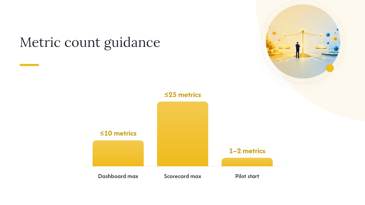
- Count your candidate metrics. More than 10 for a dashboard or more than roughly 25 for a scorecard means you’re tracking things nobody will actually use.
- Assign an owner to every metric before launch. Assigning metric owners is what separates a real management tool from a screen people glance at and ignore.
Watch for two red flags once either tool is live: analysis paralysis, where a team stares at live numbers without ever deciding anything, and metrics with no owner, which quietly turn into decoration. Experts note that leaning too hard on real-time data for strategic calls tends to produce exactly this kind of paralysis, because live numbers rarely carry the context a decision actually needs.
Pro Tip: Start small. Pilot with one or two scorecard metrics and a single operational dashboard for one team before rolling either one out company-wide.
If the checklist points to “dashboard first,” build the operational view and revisit the scorecard in 90 days once you see what patterns emerge. If it points to “scorecard first,” start with three to five strategic metrics tied to named owners and add operational dashboards underneath as gaps appear.
Combining Both: Hybrid Scorecard and Dashboard Models
The healthiest setups don’t pick one tool. They link them. A strategic dashboard surfaces top-level KPI targets at a glance, then lets an owner click down into the live operational dashboard behind each number. That’s the pattern most mature organizations land on, because it connects strategic targets to the operational action that actually moves them.
For a trade business, that usually looks like a daily operations dashboard tracking jobs completed, technician utilization, and same-day collections, feeding into a monthly owner scorecard that tracks gross margin by service line, customer retention, and technician turnover. Practitioners who build both warn against designing one master screen for every user; a single view that tries to satisfy a dispatcher and an owner at once ends up useless to both.
A practical guideline is to limit operational dashboards to around 10 primary metrics and scorecards to about 25, ensuring clear hierarchical relationships between them. This guideline is based on practitioner experience rather than formal studies, reflecting common observations about dashboard usability.
Practical notes for making the hybrid work:
- Align cadence: daily dashboard, weekly huddle on leading indicators, monthly scorecard review
- Automate dashboard feeds where possible; scorecards can tolerate manual entry since they update less often
- Keep commentary fields on the scorecard mandatory, not optional. The number without context is where analysis paralysis starts
Our HVAC KPI guidance breaks down which metrics belong on which layer for field service businesses specifically.
How Dashboards and Scorecards Fit Into Your BI Stack
Neither tool exists in isolation from the rest of your data. A dashboard is usually a front end sitting on top of a business intelligence platform, pulling from field service management software, accounting systems, phone or CRM logs, and sometimes a data warehouse if the business has grown past spreadsheets. The dashboard’s only job is to visualize that data fast enough to act on it.
Scorecards pull from the same underlying sources but at a slower cadence, often aggregating a month of dashboard-level activity into a single reviewed number. This is where a lot of trade businesses hit a wall: their field service software tracks jobs and revenue fine, but nobody has connected it to a reporting layer that can produce a clean monthly scorecard without someone manually rebuilding a spreadsheet.
The fix isn’t necessarily more software. It’s cleaner source data. A scorecard built on inconsistent job-costing entries will always show a fuzzy number, no matter how good the reporting tool looks. Get the operational data entry right first, dispatch notes, job costing, time tracking, and both the dashboard and the scorecard downstream get more trustworthy automatically. Integration problems almost always trace back to inconsistent inputs, not the reporting layer itself.
Tools for Building Dashboards vs. Scorecards
Dashboard analytics tools and scorecard software solve different problems, which is why they tend to look and feel different even when they’re pulling from the same data.
Dashboard-focused platforms prioritize speed and visual density: live charts, drag-and-drop filters, and connectors to field service or accounting systems that refresh throughout the day. These tools are built for the person who needs an answer in the next five minutes, not a narrative.
Scorecard tools, by contrast, prioritize structure over speed. They’re built around fixed fields like target, owner, and commentary, and they usually support a review workflow, someone enters a result, someone else adds context, and a manager signs off before the next period starts. Many businesses use spreadsheets for this stage simply because the review cadence is slow enough that automation isn’t the bottleneck; governance is.
The mistake most trade businesses make isn’t picking the wrong platform. It’s trying to force one tool to do both jobs. A dashboard forced into scorecard duty loses its context and ownership fields. A scorecard forced into dashboard duty updates too slowly to be useful for daily decisions. Match the tool to the cadence and the audience first, then worry about the software.
Publisher Perspective: How We Apply This With Trade Clients
We build scorecards around three or four owner-level metrics with a named accountable person and a monthly cadence, not around whatever number is easiest to pull. Every client engagement pairs that scorecard with a lean operational dashboard the field team actually checks daily. Case studies across our client base, including maintenance agreement work that drove significant revenue growth, consistently trace back to this same structure: clarity on ownership before complexity on metrics. Start with one scorecard number nobody currently owns. Assign it. Watch what changes.
— Dan
How We Help You Build the Right System
Most consultants sell you dashboard software or scorecard templates and leave you to figure out ownership and cadence yourself. A different approach is to build the governance around the numbers first, so the tools you already have (or the ones set up with help) actually get used instead of ignored after month one.

That means sitting down with your team to assign real owners to your top metrics, aligning your reporting cadence to how your business actually makes decisions, and cutting whatever KPI list has ballooned past the point of being useful. This approach has been applied in HVAC, plumbing, electrical, and other trade businesses, focusing advice on common issues like dispatch data and job costing breakdowns.
If you’re staring at either a dashboard nobody trusts or a scorecard nobody updates, check our pricing page to see how an engagement works, or start with a look at our FAQ page for common questions about how we structure the work.
Sources
For a deeper breakdown of the operational versus strategic split, Klipfolio’s explainer on dashboards and scorecards covers the accountability angle well. ClearPoint Strategy’s blog on choosing between operations and strategy is useful for pilot-testing either tool before a full rollout. For the standard fields a scorecard should include, Performance Magazine’s expert breakdown is the clearest reference on Balanced Scorecard structure available.
- What Are Dashboards and Scorecards? Key differences explained | Klipfolio
- Dashboards vs. Scorecards: Optimize operations & strategy | ClearPoint Strategy Blog
- What is the difference between a Scorecard and a Dashboard? – Performance Magazine
0 Comments